ADVERTISEMENT

Giant purple N

charcat

Well-Known Member
Apr 11, 2006
547
518
93
I was by the new lakefront practice facility yesterday. It is going to be amazing. The one remaining thing is they need a giant purple N in the roof for the world to see. Aircraft, google earth, it is a key branding opportunity.

If you know Jim Phillips or Morty, put in a good word for the giant purple N.
 
Or if we're going old-school, go with the N-Cat. I would definitely prefer the N-Cat.

When and why did they decide to bury it?
 
Because Fitz hated it. True.
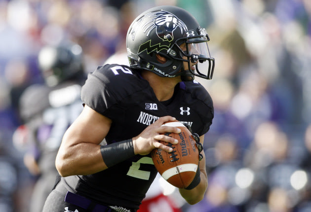
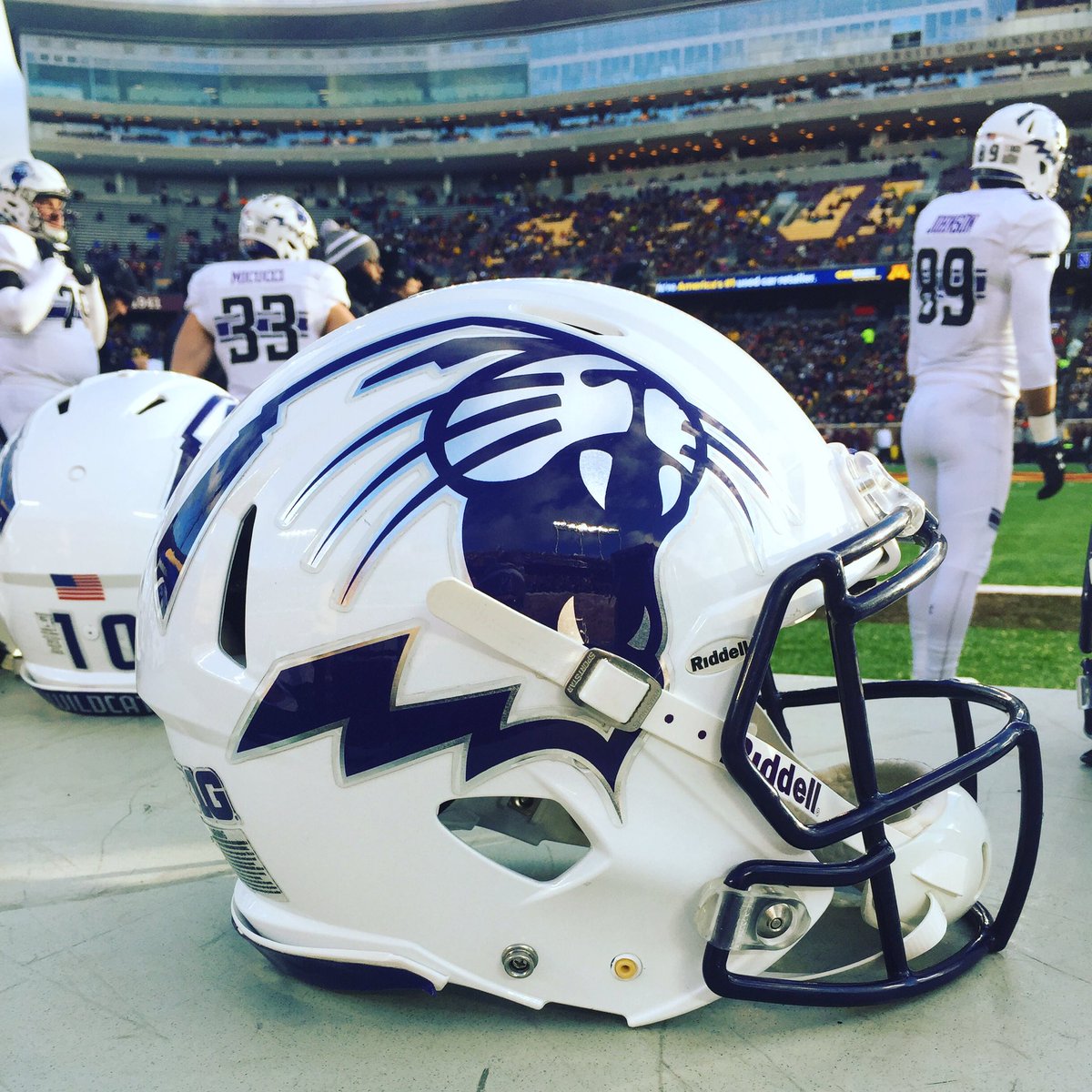
Then why do they still use the Cat (minus the N) on various alternate uniform helmets?

northwestern_black_football_helmet-620x413.jpg


uspw_6674394.jpg


Cxp_cOyUQAA-UsB.jpg


And why would Fitz hate it when he won Big Ten championships under that logo?

Because it's awful. Worst logo in the Big 10 IMO. The standalone 'N' is vastly superior.

DarthCat kicks puppies.
 
Last edited:
Then why do they still use the Cat (minus the N) on various alternate uniform helmets?

northwestern_black_football_helmet-620x413.jpg


uspw_6674394.jpg


Cxp_cOyUQAA-UsB.jpg


And why would Fitz hate it when he won Big Ten championships under that logo?


DarthCat kicks puppies.

Because the leadership council also has input. They probably said it was cool and Fitz said "ok."
 
Also, I don't consider that the N-cat. That's the 'cathead'. It's when the two are combined that the logo becomes over complicated and too busy.

I actually LOVE all those helmets. I think the roundness of the top of the cathead lends itself well to the curved helmet.

And not a puppy. A kid probably. My kid definitely. But never a puppy. ;-)
 
  • Like
Reactions: Cats20
Also, I don't consider that the N-cat. That's the 'cathead'. It's when the two are combined that the logo becomes over complicated and too busy.

I actually LOVE all those helmets. I think the roundness of the top of the cathead lends itself well to the curved helmet.

And not a puppy. A kid probably. My kid definitely. But never a puppy. ;-)
I agree with this entirely. The N-Cat is terrible from a design standpoint. Keep the elements separate.
 
The N-Cat blows. The classic N stands on its own merits. No need to muck it up.
 
Then why do they still use the Cat (minus the N) on various alternate uniform helmets?

northwestern_black_football_helmet-620x413.jpg


uspw_6674394.jpg


Cxp_cOyUQAA-UsB.jpg


And why would Fitz hate it when he won Big Ten championships under that logo?


DarthCat kicks puppies.
Who's that#2 in the middle pic? Looks like a pretty good QB
 
I'm an old geezer from before the "classic" N. I still consider it new.
I see your point, Stream, but I think we've had it on our helmets for nearly forty years now, and it runs circles around the goofy N-cat.
 
I see your point, Stream, but I think we've had it on our helmets for nearly forty years now, and it runs circles around the goofy N-cat.
I'm actually with you. I have two sons who are artists. They would tell you that the farther away something is to be seen, the simpler it should be. Detail is lost.
 
I was by the new lakefront practice facility yesterday. It is going to be amazing. The one remaining thing is they need a giant purple N in the roof for the world to see. Aircraft, google earth, it is a key branding opportunity.

If you know Jim Phillips or Morty, put in a good word for the giant purple N.
I thought Gold Coast Tickets got that?
 
  • Like
Reactions: NUCat320
I was by the new lakefront practice facility yesterday. It is going to be amazing. The one remaining thing is they need a giant purple N in the roof for the world to see. Aircraft, google earth, it is a key branding opportunity.

If you know Jim Phillips or Morty, put in a good word for the giant purple N.

And all the Wisconsin fans on airplanes flying over the campus will say, "Why is there a big "Z" on that building?"
 
  • Like
Reactions: Alaskawildkat
Or if we're going old-school, go with the N-Cat. I would definitely prefer the N-Cat.

When and why did they decide to bury it?

love the idea of the "N" on the roof.

a big reason for going away from the N + cat logo was its a nightmare from branding. hard to "center" on TV and print/apps. always looked messed up and off-center. the block N is an easier/cleaner format to represent NU
 
love the idea of the "N" on the roof.
It's a great idea. I wonder if there would be zoning issues. They had to get a signage variance for the Block N on the Taj because it was too high in elevation (27'10" above grade) to meet Evanston's requirements (15'6" Max above grade). The variance was allowed to make the N architecturally proportional to the size of the building and also because the N will not be visible from public property.
 
It's a great idea. I wonder if there would be zoning issues. They had to get a signage variance for the Block N on the Taj because it was too high in elevation (27'10" above grade) to meet Evanston's requirements (15'6" Max above grade). The variance was allowed to make the N architecturally proportional to the size of the building and also because the N will not be visible from public property.
The End zones are pretty obvious when you fly over Ryan Field. Target has a big target on it, which I find a little creepy.
 
I'm an old geezer from before the "classic" N. I still consider it new.

Long live the N-Cat.

Besides who wants to see all those N-Cat flags that flew across the world become obsolete, much less our purple paraphernalia purchases.

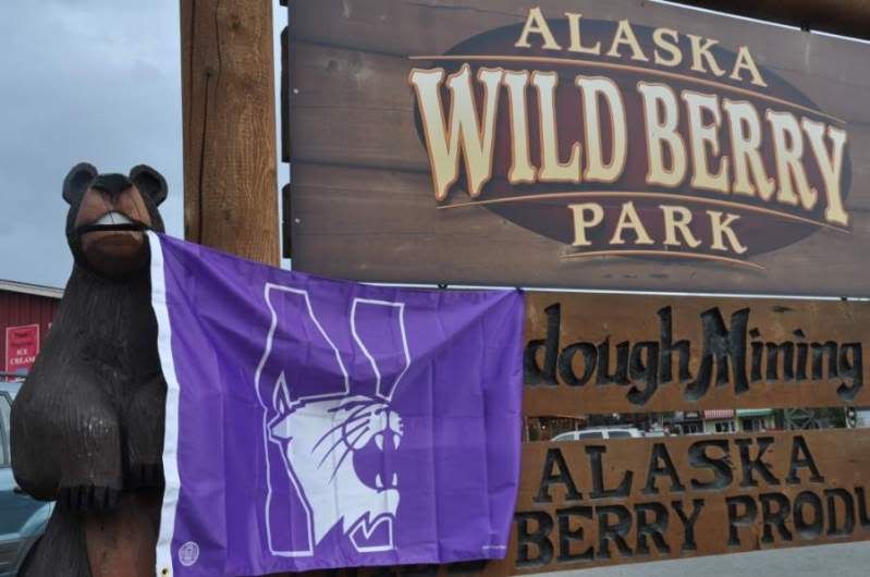
DSC_0022.jpg
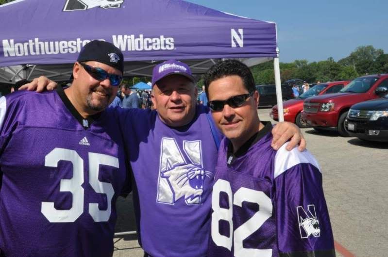
DSC_0015.jpg
DSC_0014.jpg
DSC_0025.jpg
 
Because it's awful. Worst logo in the Big 10 IMO. The standalone 'N' is vastly superior.

The problem with the standalone "N" is that it is easily confused with other schools including, but not limited to, Nebraska, Nevada, North Dakota and all the Northerns. For branding purposes the N Cat was and is
genius.


Long live the N-Cat.

Besides who wants to see all those N-Cat flags that flew across the world become obsolete, much less our purple paraphernalia purchases.

DSC_0022.jpg
DSC_0015.jpg
DSC_0025.jpg
DSC_0014.jpg
 
The problem with the standalone "N" is that it is easily confused with other schools including, but not limited to, Nebraska, Nevada, North Dakota and all the Northerns. For branding purposes the N Cat was and is
genius.


DSC_0014.jpg

The most recent "N" I came across was for "Navy" just this past week while fishing at the mouth of the Kenai. Can't believe I left that one out.
 
The problem with the standalone "N" is that it is easily confused with other schools including, but not limited to, Nebraska, Nevada, North Dakota and all the Northerns. For branding purposes the N Cat was and is
genius.


DSC_0014.jpg
Alaska, though we're on opposite ends of the opinion spectrum regarding the N-Cat, honesty compels me to grudgingly admit that during this past Big Ten tournament as I was walking around DC with my NU hockey jersey, a gentleman in a suit stopped me to ask, "Is that Nebraska?" When I explained to him that it was Northwestern, his response was, "Where is that?" A mite deflating, to say the least. :rolleyes:
 
  • Like
Reactions: Alaskawildkat
Alaska, though we're on opposite ends of the opinion spectrum regarding the N-Cat, honesty compels me to grudgingly admit that during this past Big Ten tournament as I was walking around DC with my NU hockey jersey, a gentleman in a suit stopped me to ask, "Is that Nebraska?" When I explained to him that it was Northwestern, his response was, "Where is that?" A mite deflating, to say the least. :rolleyes:

He was drunk!
 
One of the cement mixers doing the second floor deck today has a purple block N on the tank. These trucks have red and white stripes on their cement tanks, but one had two purple N's and Northwestern stripes 180 degrees apart. A small step towards an N on the roof!
 
  • Like
Reactions: Alaskawildkat
One of the cement mixers doing the second floor deck today has a purple block N on the tank. These trucks have red and white stripes on their cement tanks, but one had two purple N's and Northwestern stripes 180 degrees apart. A small step towards an N on the roof!
I didn't see the one with two stripes, I'll have to watch for that.
 
That doesn't make any sense. Plus I doubt GCT can afford leasing the roof advertisement. A purple N is my guess.

You can thank GCT for the preponderance of visiting fans in prime locations in WR and RF
 
The problem with the standalone "N" is that it is easily confused with other schools including, but not limited to, Nebraska, Nevada, North Dakota and all the Northerns. For branding purposes the N Cat was and is
genius.

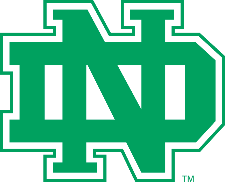
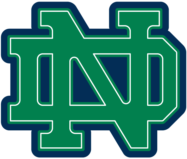
North Dakota's overlapping letters design causes it to be confused with Notre Dame, not Northwestern. Notre Dame is the 2nd logo shown below.

1966_north_dakota_fighting_sioux-alternate-1974.png
3686_notre_dame_fighting_irish-alternate-1994.png
 
Last edited:
Purple is distinctive. Block N is clean and recognizable from a distance. North Dakota using green is of course confusing with NotreDame, nobody even thinks North Dakota. Ever.

True story, about 10 years ago I went to the Frozen Four NCAA Hockey tourney in Denver. One of the official NCAA t-shirts showing all 4 teams miss spelled North Dakota as North Dakoka and nobody caught the mistake until they were selling them at the stadium...Maybe nobody noticed because they were so triggered by the big Indian on the logo....
 
Purple is distinctive. Block N is clean and recognizable from a distance. North Dakota using green is of course confusing with NotreDame, nobody even thinks North Dakota. Ever.

Nobody except former North Dakota grads. Go Fighting Sioux, er Hawks!

(UND '82)
 
Alaska, though we're on opposite ends of the opinion spectrum regarding the N-Cat, honesty compels me to grudgingly admit that during this past Big Ten tournament as I was walking around DC with my NU hockey jersey, a gentleman in a suit stopped me to ask, "Is that Nebraska?" When I explained to him that it was Northwestern, his response was, "Where is that?" A mite deflating, to say the least. :rolleyes:

Welcome to what us left coasters have to go through all the time. :rolleyes:
 
North Dakota's overlapping letters design causes it to be confused with Notre Dame, not Northwestern. Notre Dame is the 2nd logo shown below.

1966_north_dakota_fighting_sioux-alternate-1974.png
3686_notre_dame_fighting_irish-alternate-1994.png

That has to be more than coincidence. I like that North Dakota was clever enough to Trade Mark theirs though curious who was actually first and who would win in an intellectual property suit.
 
ADVERTISEMENT

Latest posts

ADVERTISEMENT